In-Vehicle Maintenance Hub Feature Creation
PROJECT SUMMARY
I helped create a single source of truth menu in-vehicle where users go and see the current status of their vehicle (e.g. tire pressure, washer fluid). The creation of this single menu location in-vehicle, with a log of past warnings, was a new feature that users wanted so they are able to understand the various flashing warnings they can get, even while driving.
PROBLEM STATEMENT
With the introduction of this new maintenance area, Ford wanted to address the concerns of drivers that while users are driving they many receive warning icons in their clusters. Often times, the warning icons will disappear after an ignition cycle; not allowing users to see the icon and look into what the issue is for their vehicle.
Making vehicle status accessible
The target audience for the in vehicle status area are drivers who want to be self-reliant and confident that they understand what is happening within their vehicle. Users want to be aware of the problems on their vehicle and to resolve them before the issues become a larger concern.
The current barrier for most drivers is that they do not have in-depth knowledge on vehicle icons and what the warnings are trying to convey. There is limited experience with how to handle vehicle maintenance
My role in the project
As the Lead UX Designer, I collaborated with our experience designer, feature owner, and front-end developer to iterate on and test possible solutions for the vehicle status area.
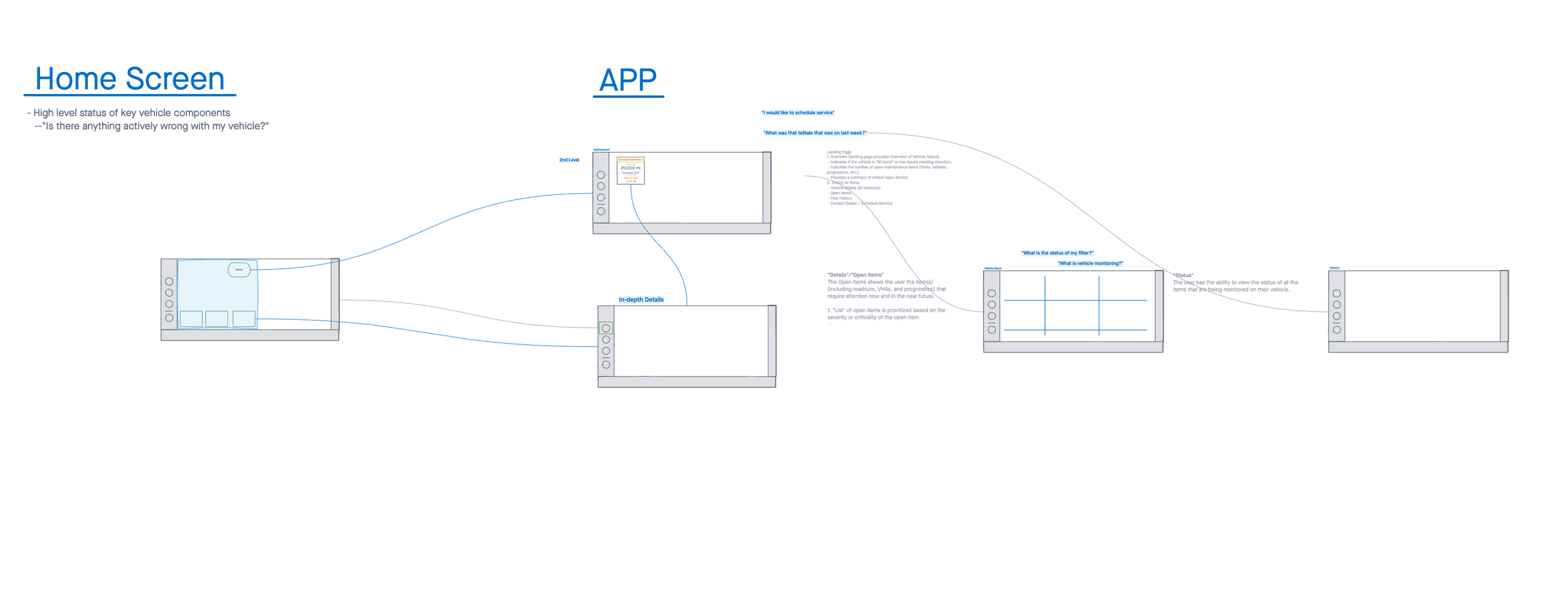
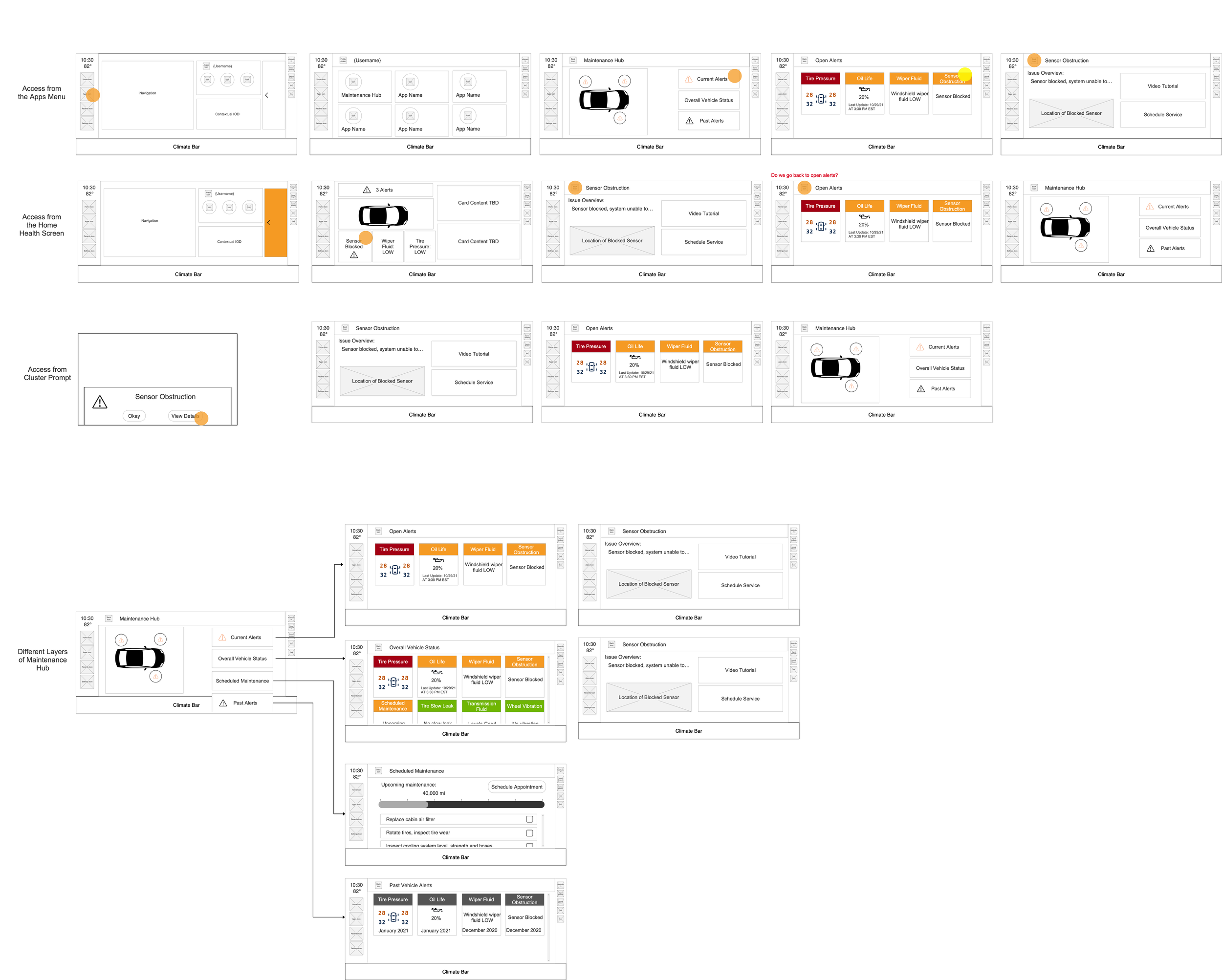
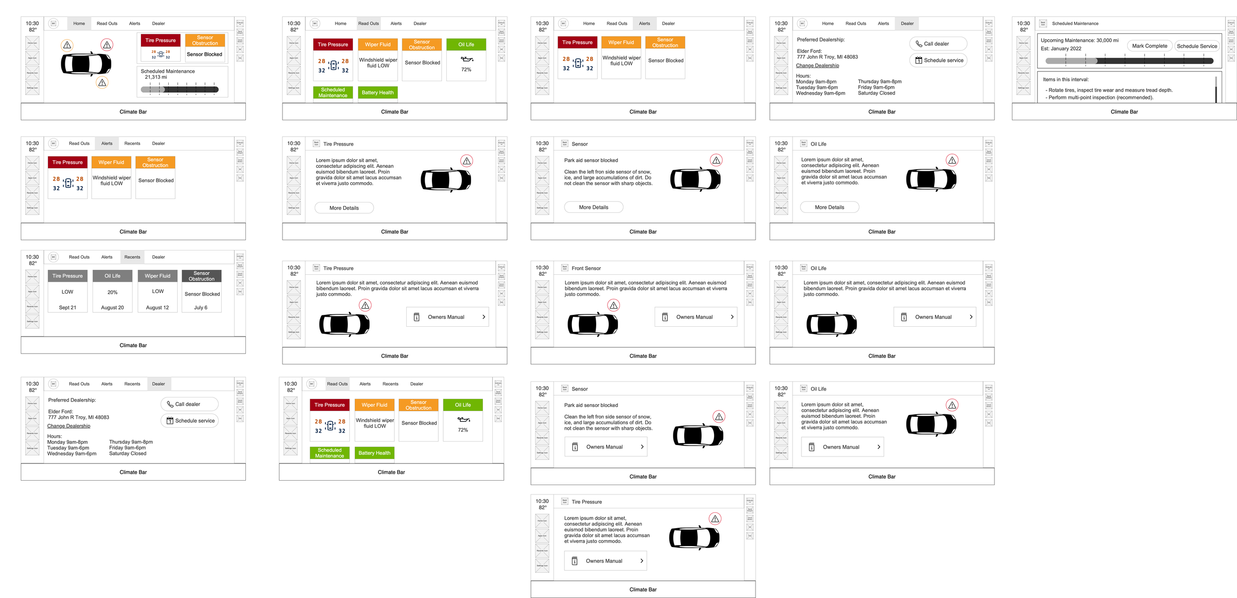
We each had specific responsibilities; my job was to collaborate on the experience flows and design wireframe screens for the team to start ideating from. This was to help everyone visual what a menu with this much information would look and feel like, to make sure we were balancing the desire to have a singular location, without overwhelming the customer.
The mandate: create a home screen zone that shows all vehicle status alerts
Our feature owners were feeling rather overwhelmed with this tall order of taking the icons traditionally shown only in the cluster screen, and integrating them into the home screen by having a single location where users could track all past alerts and get further information on the alert types.
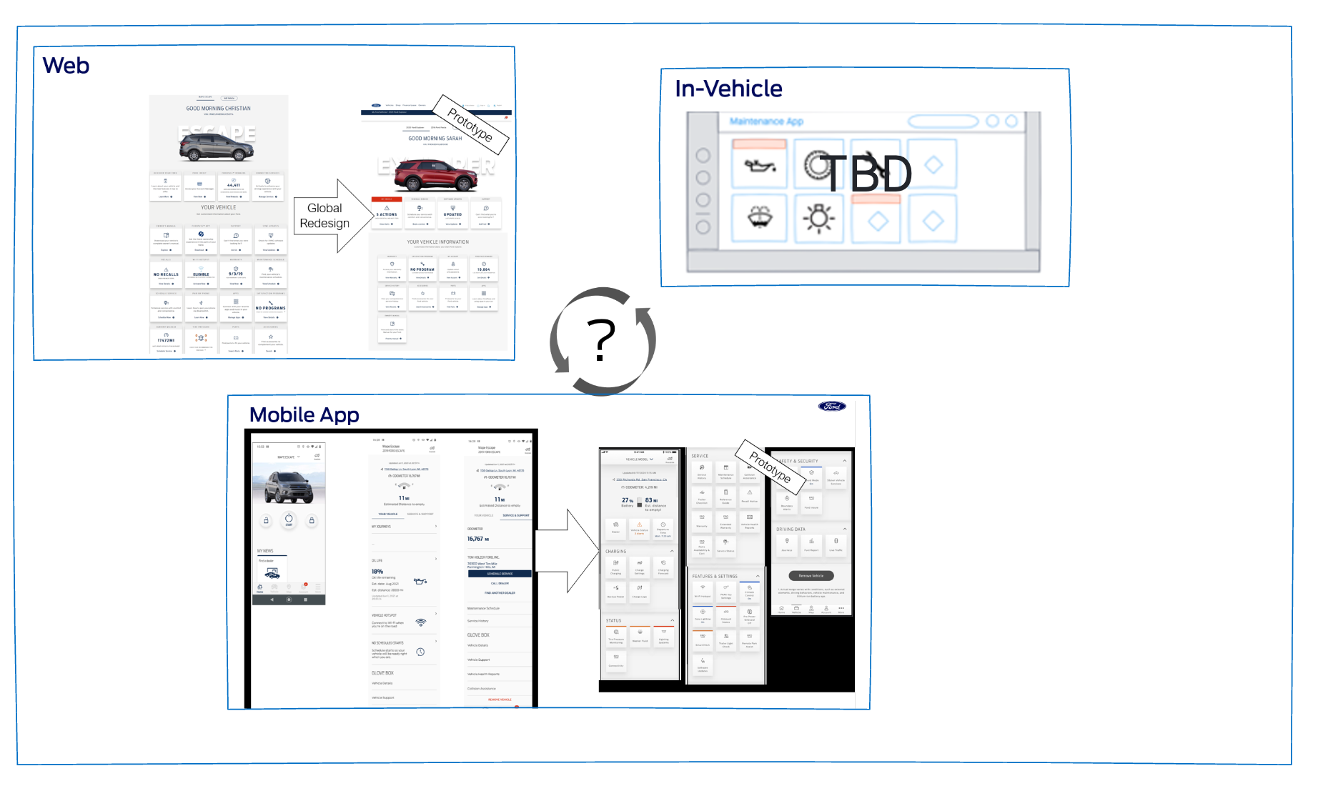
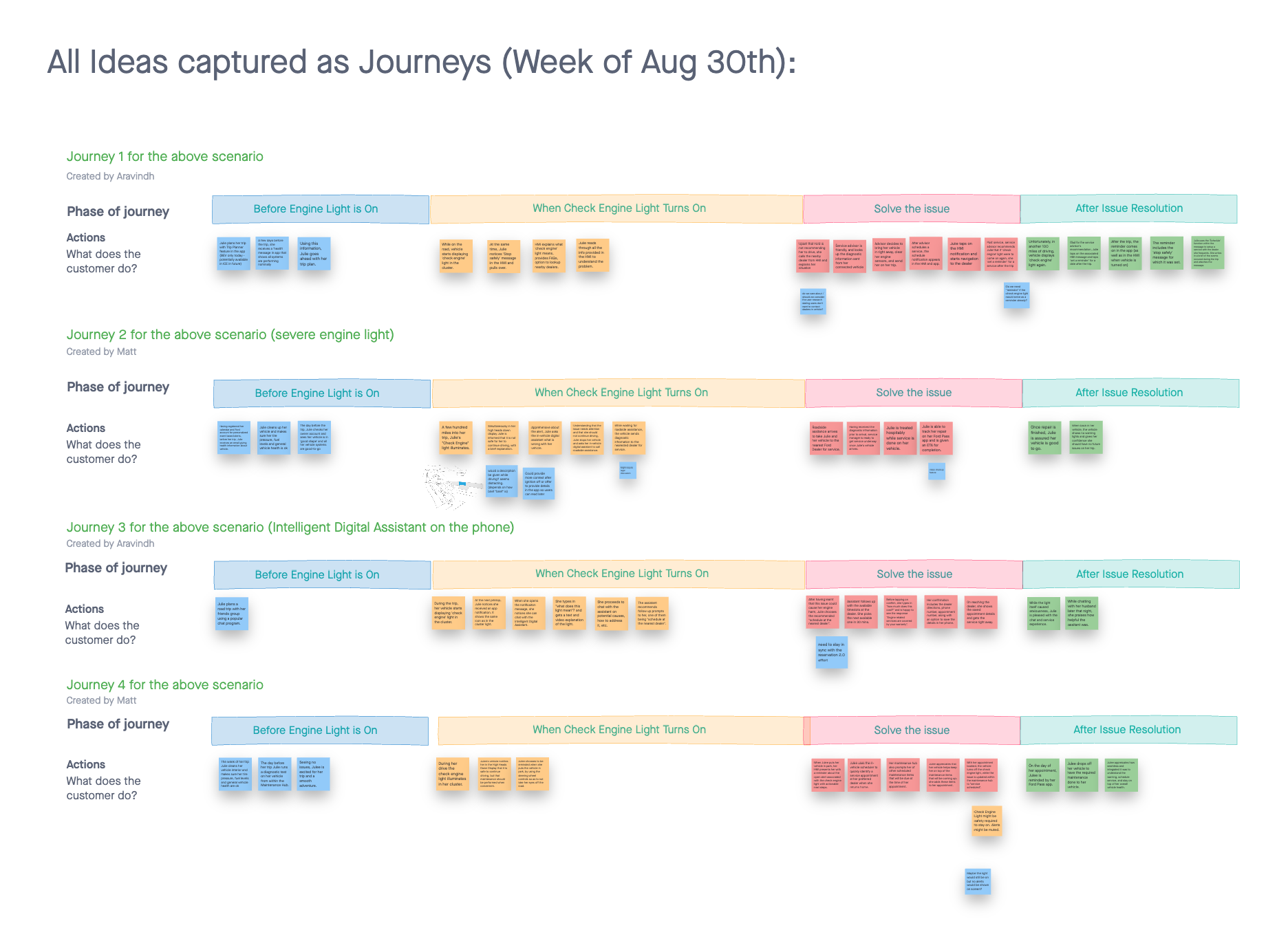
To get a better understanding of the scope and ask of the project, all teams met for a 3 day workshop to generate ideas on what they would expect from a maintenance area. From there, the experience designer and I went off and discussed the user journey, the system interaction points, and what the overall content would consist of.
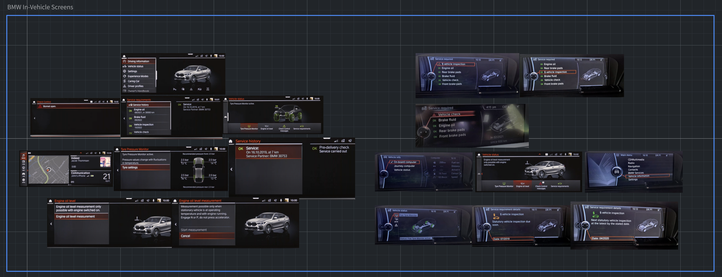
After we had a solid direction of what we wanted the users to have access to, I benchmarked the current experiences out on the market in BMW and Mercedes. Once I had an understanding of the competitors, I used all the information gathered to create wireframes to take to the team to convey the design direction we were heading in.
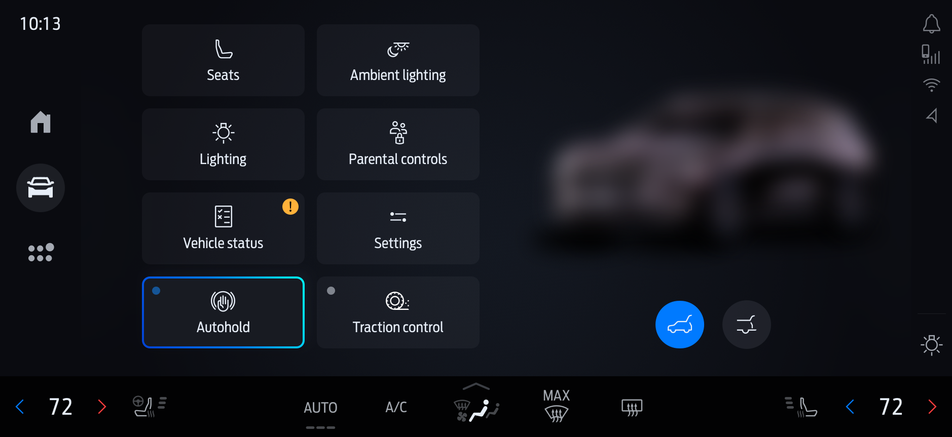
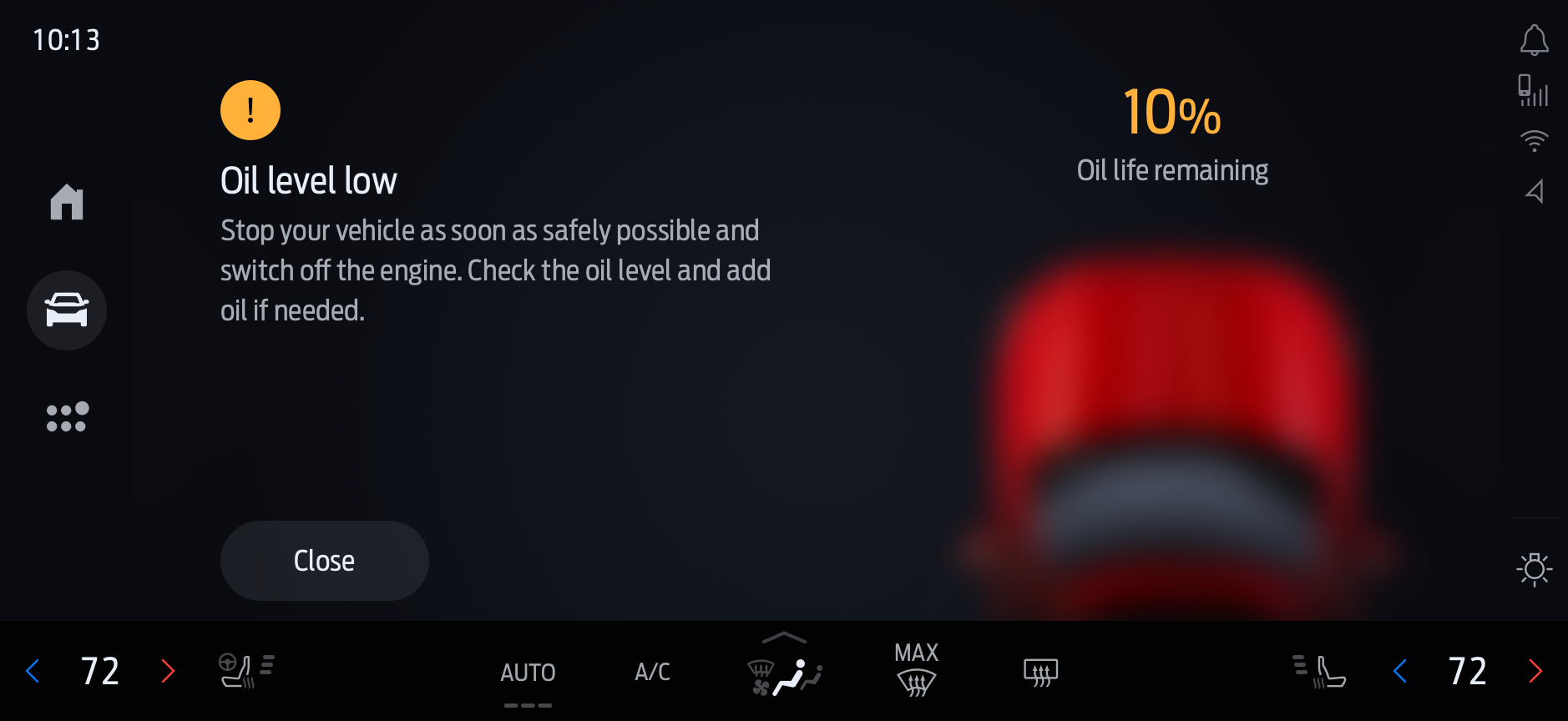
After some ideation on the content types (e.g. videos, images, links to sites) and understanding what the system could actually hold, we worked with the UI designer to heighten the fidelity of the wireframes into final renders that matched the systems design system.

